
☆ photography & digital design ☆
The following images represent the photography and web graphics I created for Profusion Cosmetics (inline collection).
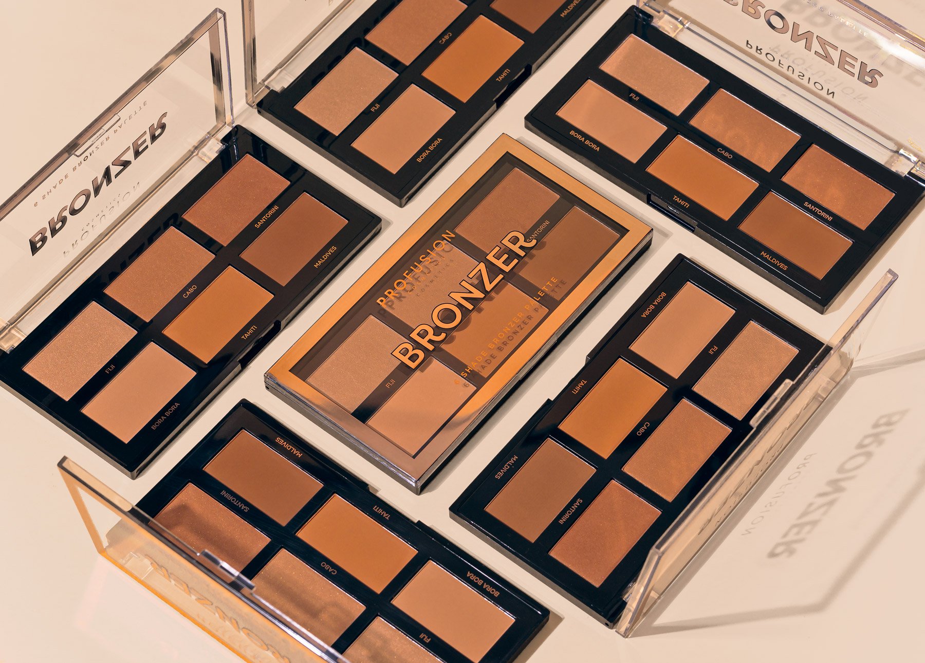
Info: My process was to stage, photograph, and retouch the product images. I then integrated the images into digital promotional graphics. When I started at Profusion, in 2020, product photography was primarily outsourced and limited in quantity. As a designer, I recognized the need for more image assets to work with, so I began taking my own. Working with limited resources helped me immensely with visual problem-solving and interdisciplinary design.
1. neutrals + pinks


Design Goals for Neutrals + Pinks
Emphasis on texture — bring the products to life with imagery that feels tactile.
Use neutral-toned backgrounds and minimal props to highlight the straightforward packaging style.

2. spring florals

Design Goals for Spring Florals:
Use flowers and natural elements to allude to spring
Bright peach and yellow replace neutral tones. Create a sense of sunlight.
Work off the flower-themed 5 shade palettes


3. neons + brights


Design Goals for Neons + Brights:
Use bright solids to frame the neon liners and eyeshadow palettes.
Create imagery that is both multi-colored and single-colored for variety.
Use diagonals in composition to create movement. Should feel energetic and fun.

WANT TO SEE MORE?
I have a page dedicated to digital campaigns, that include product photography, newsletters, and banners.
These images are for portfolio use only.
All Rights Reserved © Profusion Cosmetics